

State-level COVID-19 Modeling Results for North Carolina
Disclaimer: Simulation models represent our best understanding of complex real-world phenomena. This model is based on a prior influenza model, and is updated to reflect emerging peer-reviewed literature and local data, including from the census, Safegraph (mobility data), Facebook mask usage data, and COVID data from NCDHHS. Results in this presentation are based on a version of the model that was calibrated using reported lab-confirmed COVID cases and deaths from the NCDHHS through February 15, 2021.
Like all models, simplifying assumptions are made. Model assumptions capture many aspects known to affect COVID trends, such as the structure of interactions within and across communities and nuanced human behavioral responses – though not all. We continue to iterate this model as we learn about important factors, or as COVID context evolves (e.g., as variant dominance shifts and transmissibility changes, new vaccines become available). Data from the Behavioral Risk Factor Surveillance System is used to estimate the distribution of individuals by race, age, and comorbidity status. We also used U.S. Census tract-level data to estimate the size of households (1 to 6 people), whether or not children were present in the household, and the race/ethnicity of the household.
The models and results shown on this website refer to the following article: https://jamanetwork.com/journals/jamanetworkopen/fullarticle/2780539.
Last updated: 06/02/2021
COVID-19 infections, hospitalizations, and deaths were modeled with 4 different behavioral and policy interventions:
- Non-pharmaceutical interventions (NPIs) (includes masks, social distancing, etc)
- NPI Maintained
- Mask usage and social distancing remain at pre-vaccination levels: 70% mask usage, 15% voluntary isolation and self-quarantine. Community and workplace interaction remain reduced.
- NPI Removed
- March 27th: Workplace and community interaction including schooling return to normal, agents no longer isolate or quarantine immediately.
- Face mask usage decreases at a rate proportional to the number of agents vaccinated until the end of the vaccine distribution.
- NPI Maintained
- Vaccine Efficacy (percent of those vaccinated protected from infection)
- High: 90%
- Low: 50%
- Vaccine Rollout Speed (duration over which adults are vaccinated)
- Fast: Gradual rollout from Dec 27th to April 6th
- Slow: Gradual rollout from Dec 27th to June 25th
- Vaccine Coverage (percent of adults vaccinated by end of rollout)
- Med: By April 6th (fast rollout) or June 25th (slow rollout), coverage reaches 50% of adults.
- Low: By April 6th (fast rollout) or June 25th (slow rollout), coverage reaches 25% of adults.
These interventions were assigned values and modeled as 16 possible scenarios. The NPIs were assigned as maintained and removed, the Vaccine Efficacy was assigned 90% and 50%, the Vaccine Rollout speed was assigned fast and slow, and the vaccine coverage was assigned 50% and 25%.
The cross comparison of each value gave 16 results.
| NPIs | Times | Vaccine Efficacy | Times | Vaccine Rollout Speed | Times | Vaccine Coverage |
|---|---|---|---|---|---|---|
| 1) Maintained | X | 1) 90% | X | 1) Fast | X | 1) 50% |
| 2) Removed | 2) 50% | 2) Slow | 2) 25% |
North Carolina Daily Infections
The following interactive graph illustrates the daily new infections over time with NPIs maintained and removed, 90% vaccine efficacy, fast vaccine rollout speed, and 50% vaccine coverage.
Use the checkboxes below to turn “on” other scenarios to compare daily new infections. Note that the y-axis scale may change to allow you to better see differences. Check out Tableau functions at the bottom of the window. You can reset the original scenarios using the reset button. You can also download the graph into different types of files, including images and datasets.
Try these examples to learn more:
- Maintaining NPIs is important
- Select single values for vaccine efficacy, rollout speed, and coverage. Select both NPIs maintained and removed.
- Vaccine rollout speed is important with NPIs removed
- Select NPIs removed.
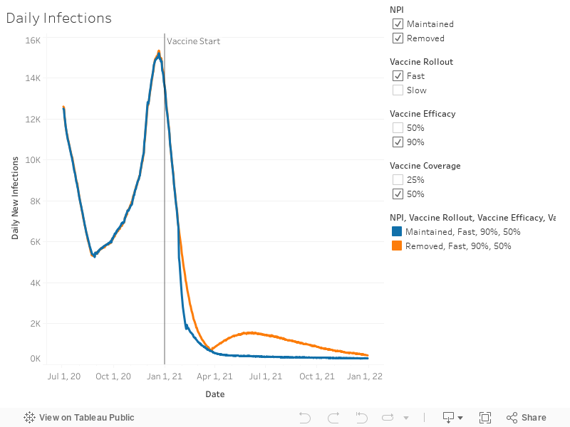
Note: Day 1 refers to July 1st, 2020. The simulation runs for a year and a half from this start date
Use the checkboxes below to turn “on” other scenarios to compare daily new infections. Not that the y-axis scale may change to allow you to better see differences. Check out Tableau functions at the bottom of the window. You can reset the original scenario using the reset button [1]. You can also download [2] the graph into different types of files, including images and datasets.


NC Hospitalizations & Deaths
The following dashboard provides interactive graphs for COVID-19 hospitalizations and deaths under the same scenario options as above.
The number of people hospitalized due to COVID-19 on a given day are shown. The number of deaths accumulate over time. Instead of showing peaks and valleys, the death curves will rise and level off depending on the pandemic.
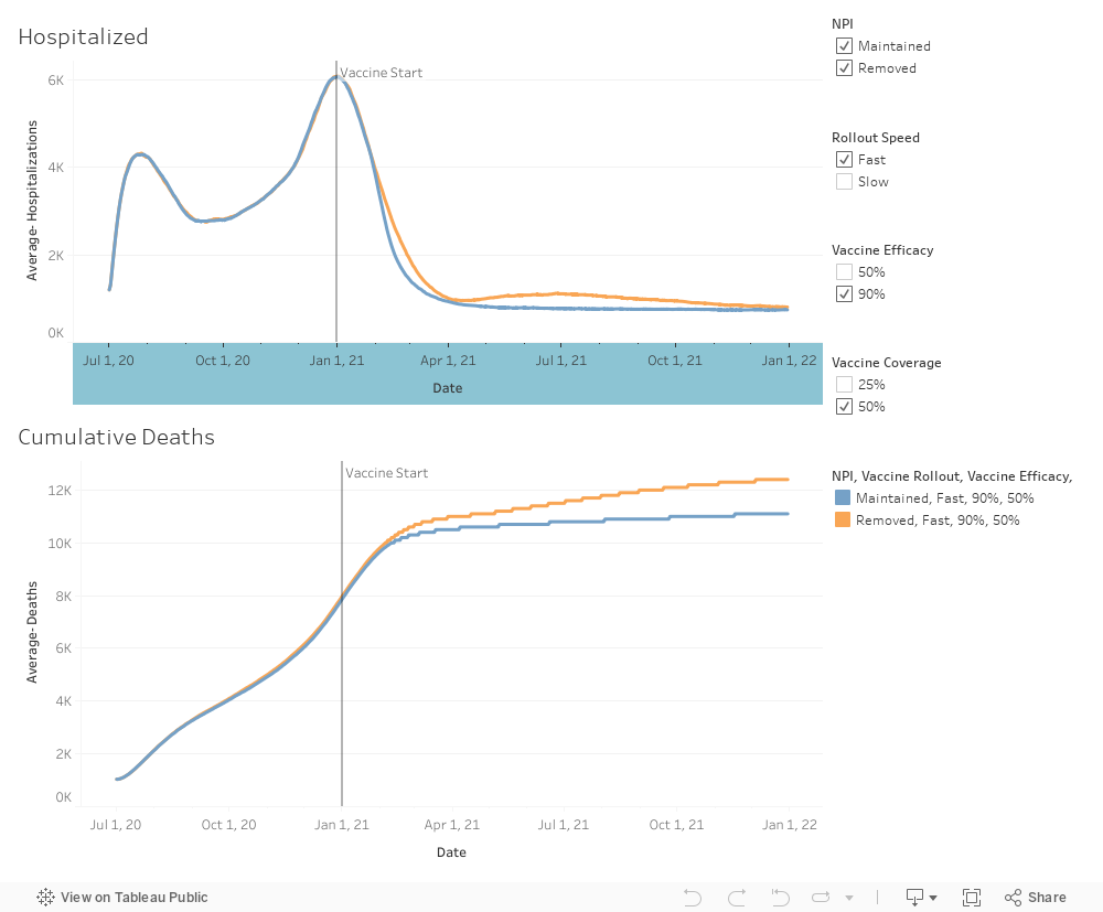
Note: Day 1 refers to July 1st, 2020. The simulation runs for a year and a half from this start date
Use the checkboxes below to turn “on” other scenarios to compare daily new infections. Not that the y-axis scale may change to allow you to better see differences. Check out Tableau functions at the bottom of the window. You can reset the original scenario using the reset button [1]. You can also download [2] the graph into different types of files, including images and datasets.